
This article is part of our complete guide to building a Chrome extension.
In the previous articles on creating a Chrome extension and adding an options page to a Chrome extension, we built two user interface pages – the popup and the options page. In this article, we will improve the look and maintainability of our extension by adding a CSS framework.
Why add a CSS framework?
Using a CSS framework like Tailwind CSS or Bootstrap can help you:
- Quickly style your extension
- Make your extension look professional
- Save time on writing custom CSS
- Improve the maintainability of your code
- Use pre-built and optimized components
Add CSS to the webpack bundle
Before we can use a CSS framework, we need to add CSS integration to our webpack bundle. In adding webpack to a Chrome extension, we set up webpack with a static CSS file. We will include the CSS file as part of our JavaScript bundle. Although the CSS files can be kept separate, we will include them in the JavaScript bundle since this is currently the best practice in web development.
We will use style-loader to inject CSS into our JavaScript and
css-loader to convert our CSS file to a string. First, install the
packages:
npm install --save-dev style-loader css-loader
Then, update the webpack.common.ts to include the rule for CSS files:
{
  test: /\.css$/,
  use: [
    "style-loader",
    "css-loader",
  ],
},
Move the CSS files from the static folder to the src folder, and update the popup.ts and options.ts to import
the CSS files:
import "./popup.css";
import "./options.css";
And remove the link CSS references from the static/popup.html and static/options.html HTML files.
When you run npm run build, the CSS file content will be included in the JavaScript bundle. You can verify this by
inspecting the dist folder and looking at the popup.js and options.js files.
Add Tailwind CSS
We will use Tailwind CSS for our extension. It is a popular CSS framework focused on providing CSS utility classes. First, install these packages and generate the TypeScript config file:
npm install --save-dev tailwindcss postcss-loader
npx tailwindcss init --ts
postcss-loader is a webpack loader that processes CSS with PostCSS.
PostCSS is a plugin-based CSS transformer recommended for integrating Tailwind CSS with the webpack build flow.
Update the webpack.common.ts CSS rule to include the loader for PostCSS with the tailwindcss plugin:
{
  test: /\.css$/,
    use: [
      "style-loader",
      "css-loader",
      {
        loader: "postcss-loader",
        options: {
          postcssOptions: {
            plugins: ["postcss-import", "tailwindcss"],
          },
        },
      },
    ],
},
The postcss-import plugin processes @import statements in CSS files,
which we will use in the next step.
Update the generated tailwind.config.ts file to point to our HTML files:
import type { Config } from 'tailwindcss'

export default {
  content: ["./static/*.html"],
  theme: {
    extend: {},
  },
  plugins: [],
} satisfies Config
Use Tailwind CSS utility classes in the HTML and CSS files
This section will update our CSS to use Tailwind CSS utility classes. Using Tailwind CSS utility classes is a slightly different approach to writing CSS. Instead of writing custom CSS classes, we use pre-built utility classes to style our elements. It is a small step above writing raw CSS, but it is more maintainable and easier to read. Utility classes are documented in the Tailwind CSS documentation.
First, we create a new CSS file, src/common.css to contain styles shared by both pages:
@tailwind base;
@tailwind components;
@tailwind utilities;

.my-input {
    @apply block m-1.5 p-2 bg-gray-50 border border-gray-300 text-gray-900 text-sm rounded-lg focus:ring-blue-500 focus:border-blue-500;
}
The @apply directive is a Tailwind CSS feature that allows us to create a custom CSS class using Tailwind CSS utility
classes.
Then, update the popup.css and options.css files to use the Tailwind CSS classes. popup.css will use Tailwind CSS
utility classes:
@import "./common.css";

.my-center {
  @apply w-full inline-flex items-center justify-center;
}

.my-button-link {
  @apply text-indigo-400 m-1.5 px-3 py-1 text-xs outline-none focus:outline-none ease-linear transition-all duration-150;
}
options.css will only use our common CSS file:
@import "./common.css";
Next, we update static/popup.html to use our new CSS classes as well as other Tailwind CSS classes:
<html lang="en">
<head>
    <title>My popup</title>
</head>
<body>
<label class="my-center cursor-pointer">
    <input id="enabled" type="checkbox" class="sr-only peer" />
    <span class="m-1.5 relative w-16 h-8 bg-gray-200 rounded-full after:content-[''] after:absolute after:top-0.5
         after:start-[4px] after:bg-white after:border-gray-300 after:border after:rounded-full after:h-7 after:w-7
         after:transition-all peer-focus:outline-none peer-focus:ring-4 peer-focus:ring-blue-300
         peer-checked:after:translate-x-full rtl:peer-checked:after:-translate-x-full peer-checked:after:border-white
         peer-checked:bg-blue-600"
    ></span>
</label>
<label for="item" class="invisible"></label>
<input class="my-input w-52" id="item" type="text" />
<div class="my-center">
    <button id="go-to-options" class="my-button-link">Advanced options</button>
</div>
<script src="popup.js"></script>
</body>
</html>
We built a custom checkbox using Tailwind CSS utility classes. The peer class styles the checkbox and the label
together.
And static/options.html:
<!doctype html>
<html lang="en">
  <head>
    <title>Advanced options</title>
  </head>
  <body class="m-1.5">
    <h2 class="text-3xl m-1.5 font-extrabold">Advanced options</h2>
    <br />
    <h3 class="text-xl m-1.5 font-bold">Web host to exclude</h3>
    <label for="exclude_host" class="invisible"></label>
    <input id="exclude_host" class="my-input w-96" type="text" placeholder="example.com"/>
    <script src="options.js"></script>
  </body>
</html>
Testing the extension, we should see a nicer-looking popup page:
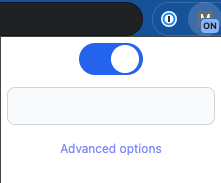
Popup with Tailwind CSS classes
And a nicer-looking options page:
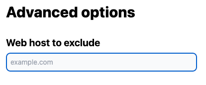
Options with Tailwind CSS classes
Next steps
In the next part of this series, we will add unit tests to our Chrome extension. Unit tests help us catch bugs early, ensure our extension continues to work as expected in different scenarios and make it easier to refactor our code.
CSS framework code on GitHub
The complete code is available on GitHub at: https://github.com/getvictor/create-chrome-extension/tree/main/6-css-framework
CSS framework video
Note: If you want to comment on this article, please do so on the YouTube video.